Summarize this text with artificial intelligence
Choose your preferred tool to generate a short summary of the text.
Colors influence how your brand is perceived. To position your brand in the minds of your target audience, you need to leverage the meanings of colors. This way, you can attract your ideal customers and strengthen your bonds with them. Color psychology is used to create a brand that is both powerful and relatable.
For example, which colors come to mind when Coca-Cola and McDonald's are mentioned? Businesses like these have managed to secure a place in your mind through brand color psychology. Additionally, brand colors also affect your feelings and emotions.
Therefore, in the process of creating a brand identity, you need to know the meanings of colors well. Because you should use the symbolism of colors to your brand's advantage. In this article, we will examine how color choices affect your brand, the meanings of colors, and other details. Let's get started!
What is Color Psychology?
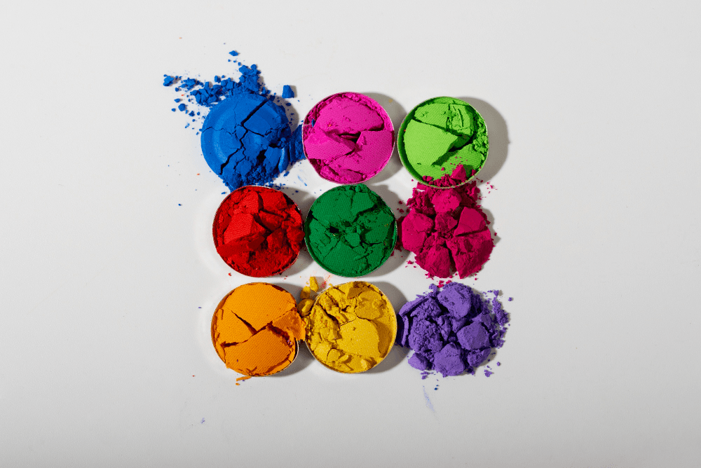
The science that studies how color affects human behavior and emotions is called color psychology. Different colors influence human mood and decision-making processes. Additionally, color psychology can vary based on personal preferences and different cultures.
In marketing, color can affect how buyers perceive the company. Therefore, you should make sure that you choose colors according to your business's purpose and your target audience.
What is Brand Color Psychology?
Brand color psychology is the study of how colors affect a brand. For example, it seeks answers to the question: Which color attracts people's attention? In this way, the effects of colors on psychology are examined in detail. Because colors have a powerful effect on human emotions. These emotions drive consumer behavior.
Colors carry different meanings. This is why people prefer one color over another. The psychology of colors must be used in your branding and marketing processes. Of course, you can lean toward your favorite colors when determining your brand color.
However, you shouldn't dive in blindly without knowing the meaning of colors. For instance, many fast-food brands use the color red. Sustainable brands, on the other hand, prefer the color green.
Because the color red can trigger hunger. The color green, meanwhile, evokes the environment. As an entrepreneur, researching the psychological effects of colors can help you create a more effective and memorable brand.
The Importance of Color Psychology in Branding
Color evokes emotion. That is, it stirs up feelings. Therefore, the importance of color psychology in branding and marketing must be understood. Using the right color in marketing sets your brand apart in the competition. Using the right color in branding helps your business appeal to a larger audience.
Consequently, color psychology is one of the topics that should not be ignored in marketing and branding processes. When you are strategic in your color selection, you can increase your brand awareness. This allows you to depict your brand exactly how you want.
Additionally, selecting the right color enhances your brand perception. However, wrong color selection harms your brand image. The psychology of colors in marketing and branding deeply affects people's decisions. For this reason, you must proceed carefully when choosing colors. Most importantly, you should take care to remain consistent with your brand values.

Colors and Their Meanings
The meanings and psychological effects of colors have been researched by many experts. It has been revealed that each color has its own unique effect on consumers. It is necessary to act knowing the effect of colors on humans in marketing and branding efforts. So, let's examine the meanings of colors in detail.
1. Red
Red contains warm emotions such as passion, love, and anger. At the same time, you can project feelings of excitement, passion, energy, danger, and action with red. You have probably seen some brands use red packaging to stand out in the competition.
Additionally, red is one of the most intense colors. Therefore, if you want to reflect an emotion intensely in your brand, you should choose the color red. Iconic brands like Coca-Cola and YouTube use the color red.
Red, which stimulates the appetite, is also a highly popular color due to the excitement it creates. If you want to use the color red in your brand, you should also have calls to action. To create a global brand, you must examine in detail how big brands use colors.
2. Green
In color psychology, green is associated with nature and money. Growth, fertility, health, and generosity are among the positive meanings of the color. If you are in the health or fitness niche, you can feature the color green in your brand.
At the same time, if you want to create a sustainable brand, you must utilize the power of the color green. For example, you can use the color green in your homepage banner image and in your logo. On the other hand, green is a cool color.
Cool colors make people feel calm. Therefore, the color green is used by financial brands. This is because it also represents wealth, prosperity, and stability. Similarly, Starbucks is one of the brands that use the color green. Starbucks chose green to convey calmness and sophisticated ideals.
3. Orange
The color orange represents adventure, enthusiasm, creativity, success, and balance. When you use this color anywhere in your brand, you add fun to your business. Many marketers proceed with orange color psychology to issue a call to action or draw attention to a website.
Burger King has blended the colors red and orange in its brand logo. Therefore, you can use red by combining its warmth with the joy of orange.
In other words, if you are considering entering the fast-food sector, you should benefit from the harmony of these colors. You can use orange anywhere in your brand to reflect vitality, creativity, and accessibility.
4. Yellow
The color yellow reflects feelings of happiness and positivity. It also evokes optimism and the summer season. It can also convey feelings of deception and caution. Some brands prefer using yellow in their website design.
A little touch of yellow can make your store feel fun. Yellow is used by Ferrari and Ikea. Many people dream of driving Ferrari vehicles.
Because the brand evokes happiness and the summer season in its colors. In other words, Ferrari makes a difference by using the color yellow, which is associated with a carefree lifestyle, in its logo. Ikea also utilizes the power of yellow to influence people who want happiness and peace in their homes.

5. Blue
Blue is connected with the sky and the sea. It is associated with tranquility, integrity, calmness, wisdom, and reliability. It is known as the representative of peace and serenity. In Latin America, it is associated with the Virgin Mary.
Because it represents trust, it is especially used by companies in the medical industry. When you use blue in your brand, it becomes easier to gain customer loyalty. It is used by accountants, banks, insurance, and financial companies. Brands appealing to adults frequently prefer blue.
Technology brands such as Facebook and Skype leverage the power of blue in marketing. Brands like Walmart and Oral B also use blue. If you want to resonate in the market with trusted products, you should proceed with the energy and power of blue.
6. Purple
Purple is one of the noble colors. The color is associated with power, nobility, luxury, and spirituality. You can use purple in some parts of your brand. However, you should avoid using it excessively.
When overused, there is a possibility of being perceived as an arrogant brand. It is generally used by brands that sell products related to women and children. It is also gradually becoming popular in male-targeted brands.
Academic institutions include purple in their brands to highlight knowledge and intelligence. Yahoo utilizes the power of purple. In addition, brands like Milka and Gratis have also preferred purple. Furthermore, you can use purple if you want to sell antique and handmade products or add a nostalgic feel to your brand.
7. Pink
Pink gives a softer feel than red. It represents compassion, love, and femininity. It is often used by charities because of its compassion and warmth.
In addition, brands like Victoria's Secret and Penti prefer the color pink. If you want to attract young audiences, it is possible to stand out with pink. It can also be preferred by bakeries and sweet shops.
On the other hand, romantic resorts and floral designers can also benefit from the power of pink. Brands selling baby products should prefer pastel pink. Pastel pink is generally used in baby brands because it allows you to create a soft and delicate brand identity.
8. White
White is associated with light, goodness, innocence, and purity. When used in design and branding, it creates aesthetics. White comes to mind when cleanly and fresh are mentioned. In some parts of the world, white has a negative meaning.
Therefore, you should research the meaning of white in detail according to the locations you want to serve. But white is among the most used colors by e-commerce brands, because white is usually used as the background color in product photos. If used in the background, white adds professionalism to your shoots.
At the same time, a black font on a white background increases readability. Brands like Nike and Gucci benefit from the power of white. Brands whose main color is white also use gray and black.
9. Black
Black is a popular color in the retail sector. It represents mystery, power, elegance, and sophistication. At the same time, it evokes emotions such as sadness and anger. Because it is one of the versatile colors, it is used a lot in design. When it comes to branding and marketing, it is also associated with exclusivity.
If you want to create a bold, mysterious, and luxurious brand, you can benefit from black. Brands like Nike, Apple, Chanel, Mercedes-Benz, and Louis Vuitton use black. For example, Chanel preferred black for its logo. It also used black to achieve consistency on its website. Nike utilized black, white, and gray on its website.
10. Gray
In color psychology, gray represents neutrality. It is also associated with balance. If you want to use gray in your brand, it is recommended to create contrast with bright colors.
Gray, which is one of the mature and professional colors, is used by the Apple brand. Most of its products are made in gray. Additionally, Nissan and Swarovski have also utilized the power of gray.
Brands that want to be reliable and clear benefit from gray. When using gray, you should achieve a balance between white, black, and gray. Most major brands have done this balancing.
Additionally, gray is mostly preferred by financial and technology companies. At the same time, if you want to advance in the automotive sector, gray can add professionalism to your brand.
How to Use Colors Effectively?
Color communicates thoughts and emotions. The effect of colors on marketing must be known by brands. Because colors are a powerful tool in the arsenal of marketers or business owners. Here are the elements you need to know to use colors effectively.
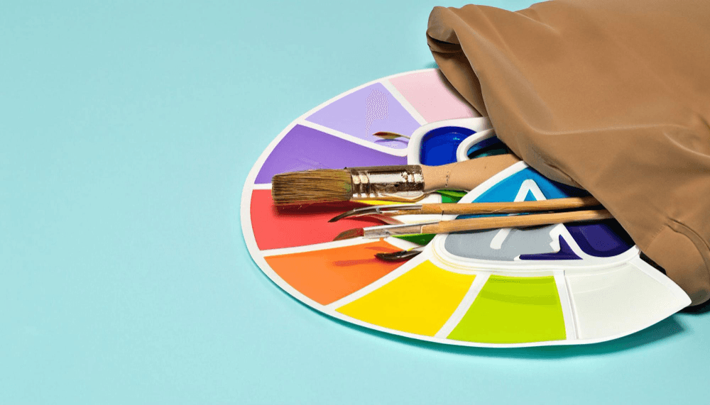
• You must thoroughly understand the elements of basic color theory. You should create balanced contrasts between the colors you use. That is, you need to capture visual harmony.
• When choosing colors, you can get inspired by the brands around you. You should think about how you feel when examining the colors around you.
• You must know the meanings of colors. That is, you should research color psychology thoroughly.
• You should think of brands like Coca-Cola, Pepsi, Starbucks, and Facebook. These brands value brand consistency. In other words, you should take care to be consistent and flexible when choosing colors for your brand.
• You should get feedback from your potential audience or experts. You should make updates and adjustments based on the feedback.
• You must keep the cultural context in mind. That is, you must know that color perception is not universal.
How Does Color Psychology Affect Your Brand?
Understanding color psychology in branding allows you to shape consumer behavior. After all, emotions directly affect behavior. At the same time, it helps you evoke specific emotions in the minds of your target audience. In other words, when it comes to your brand, colors have a significant impact on consumers' purchasing decisions.
Most customers may prefer brands based on their colors. This is how color psychology can affect your brand. Color is one of the most fundamental visual stimuli in the human cognitive process. Therefore, colors must be used correctly and appropriately in marketing and branding.
How Does Color Influence Consumer Behavior?
Colors evoke certain emotions in people. This makes them a part of commercial marketing. Therefore, they are the most important elements of packaging and advertising. At the same time, colors have the power to change behavior.
The colors you choose for your brand, target audience, and products can affect your revenue. For example, let's say you have a store where you sell candy. The color red evokes sweetness. You can use red for this. At the same time, you can also use pink.
You should take the time to determine which colors align with your brand values. After making the color selection, you should get the opinions of professionals. This way, you can get a chance to be among world-famous brands.
We Wish You the Best of Luck!